CREATIVE DIRECTION & BRANDING

The Polaris Music Prize is a Canadian music prize with a focus on rewarding musicians based on merit, not popularity. They were in need of a revitalization, without having the capacity to do a full rebrand. So, I started with small changes that had big impact: cleaning up the logo, getting consistent across social channels, and elevating visuals through new colours and fonts.
Polaris is a mission driven not-for-profit organization. So, when thinking about what drives their content, the central question was “what best serves our artists, and our community?". This led to developing a content and branding strategy that is cool without being overstated; relevant, but built on legacy.
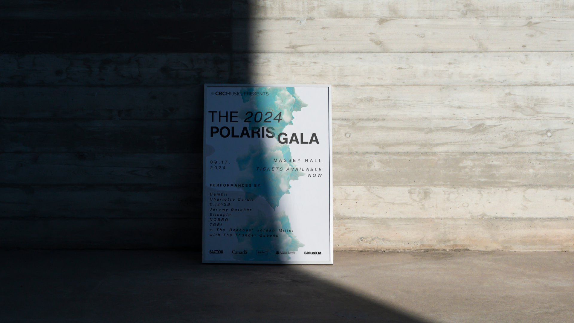
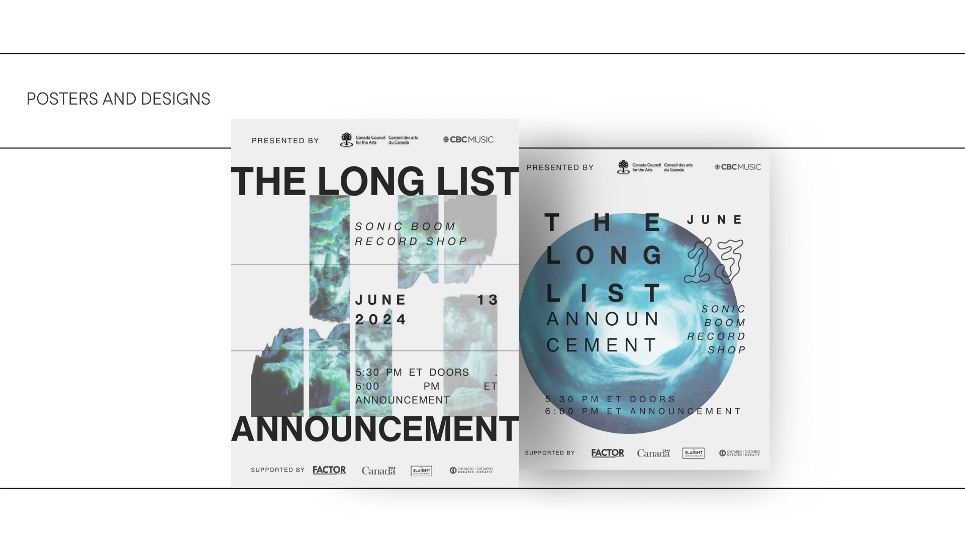

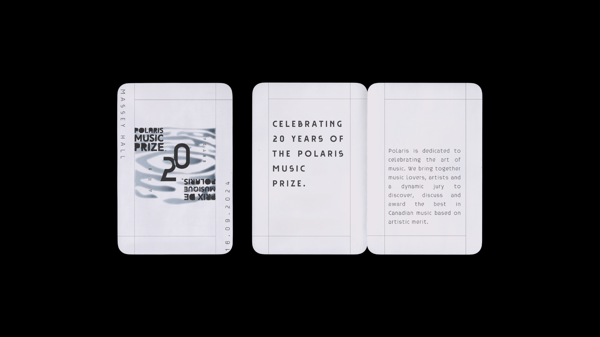
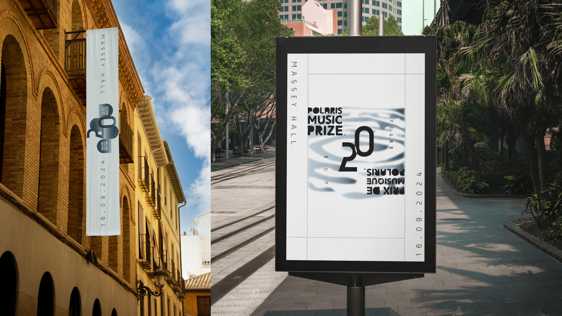
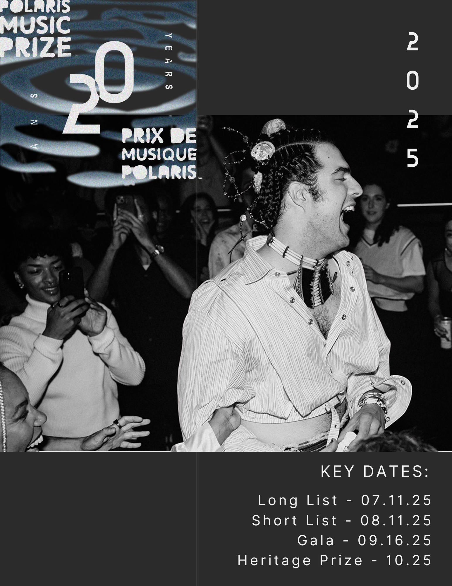
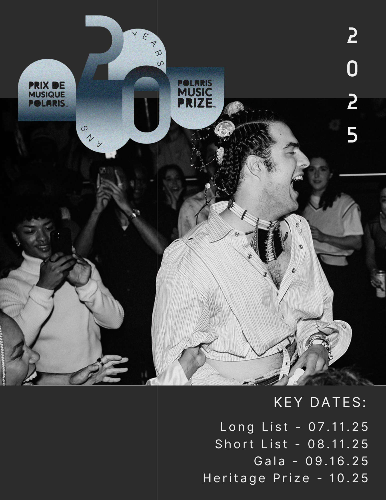
To celebrate 20 years of the Polaris Music Prize, I created a special edition logo, which incorporates the existing logos in both French and English. The theme I chose to work with was r water. Each year, the prize theme focuses around an element of Canadian life, and last year’s was ice.
The theme of water represents a time of reflection; the ice melting to look back at the last 20 years, and also create a vision of the future.
