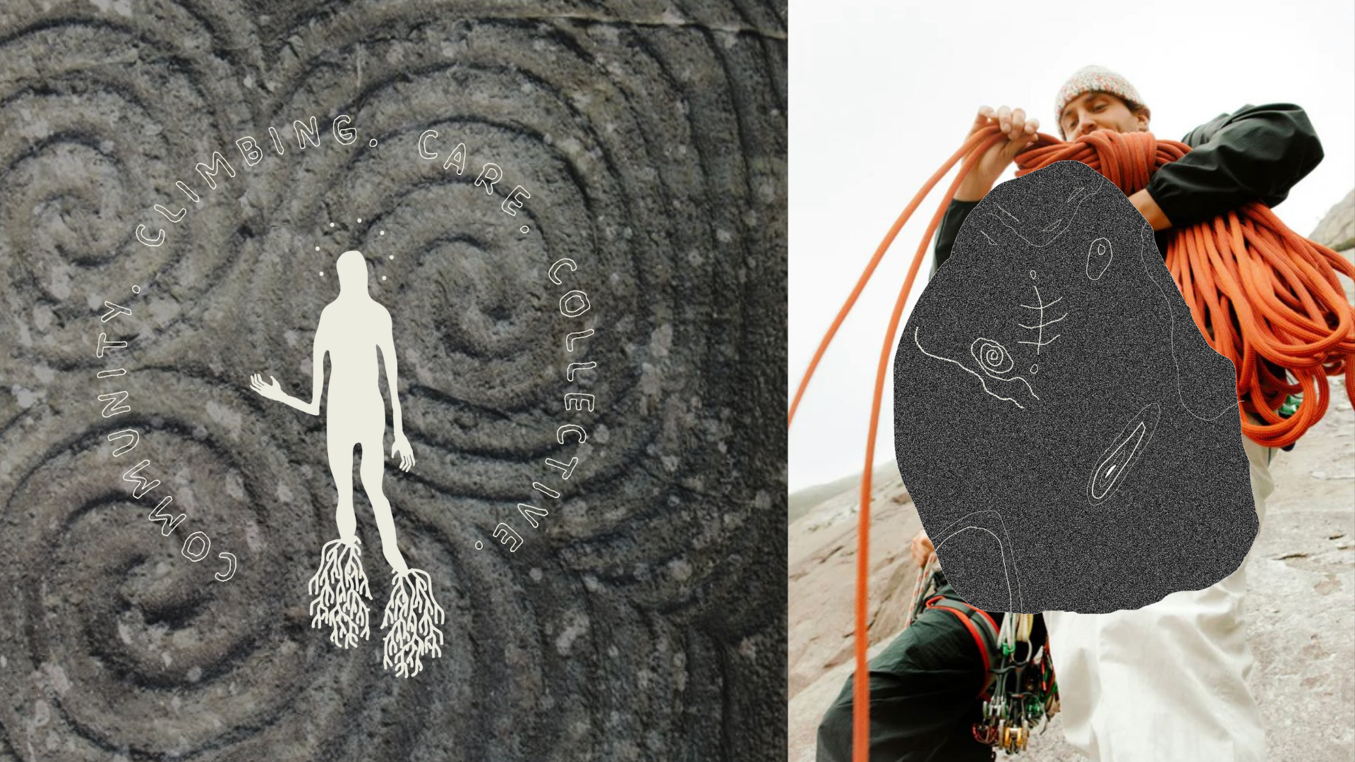
BRANDING DESIGN

Shakti is a climbing gym for the dirtbags, the DIYers, the artists and everyone in between. The #1 value of the gym is community, and coming in close second is a connection to nature. A plethora of new climbing gyms have burst onto the scene, focused on competition style bouldering.
Shakti really carves its own niche in the market with their crack climbing system, and old-school setting, which is really for those who want to train to climb outside. The culture in some climbing gyms can be, well, for lack of a better word: Bro-ey. Shakti is a community, where everyone is welcome and the culture is warm and encouraging.

The Logo & Wordmark
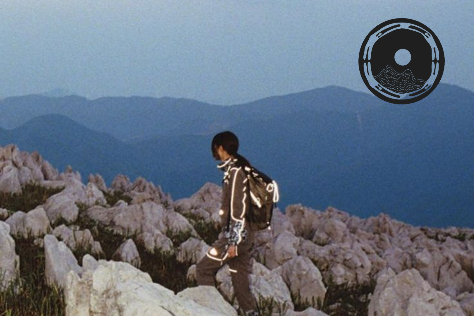
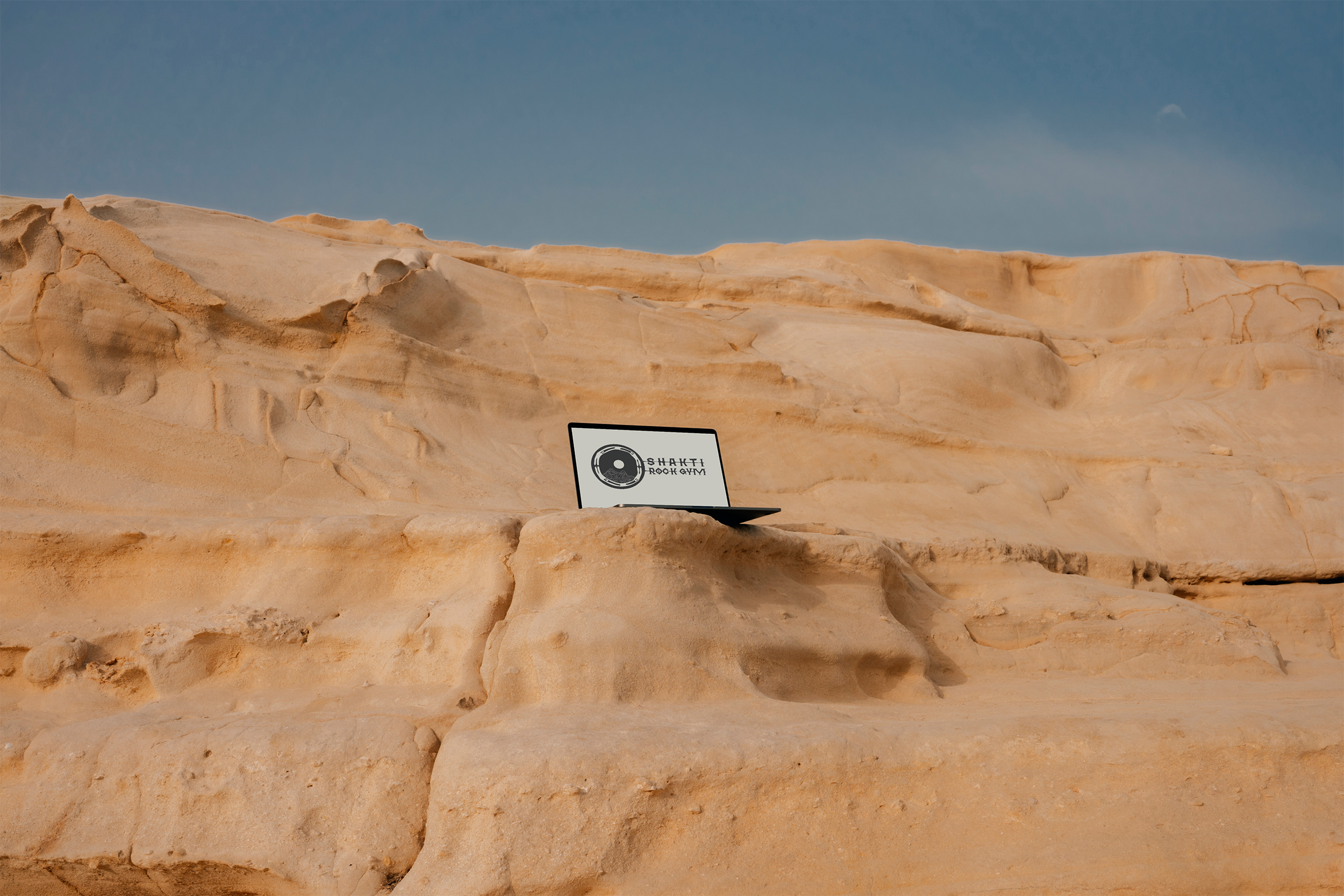
The logo design combines shakti’s values: the circular bodies representing connection and community, the topographic mountain and sun representing nature, and the warm hand-drawn texture of it communicating the DIY culture.
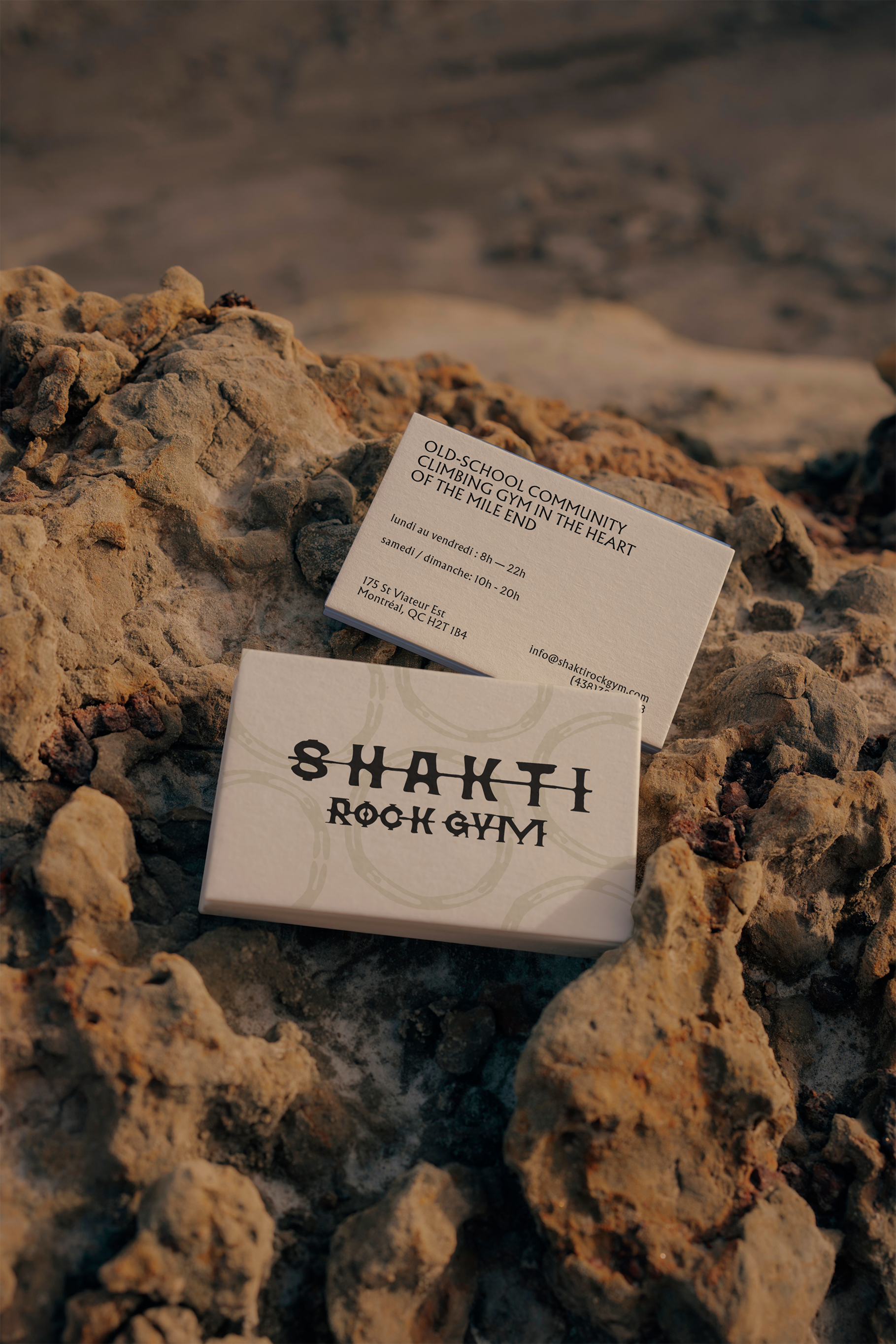
There are generous variations of the logo for various uses. The word mark is a custom font designed and made by me. There are a variety of hand-drawn illustrations in the brand book for use across socials and promotional content.


